
TW Communications
“The Future of Business Communications Starts Here.”
THE CHALLENGE.
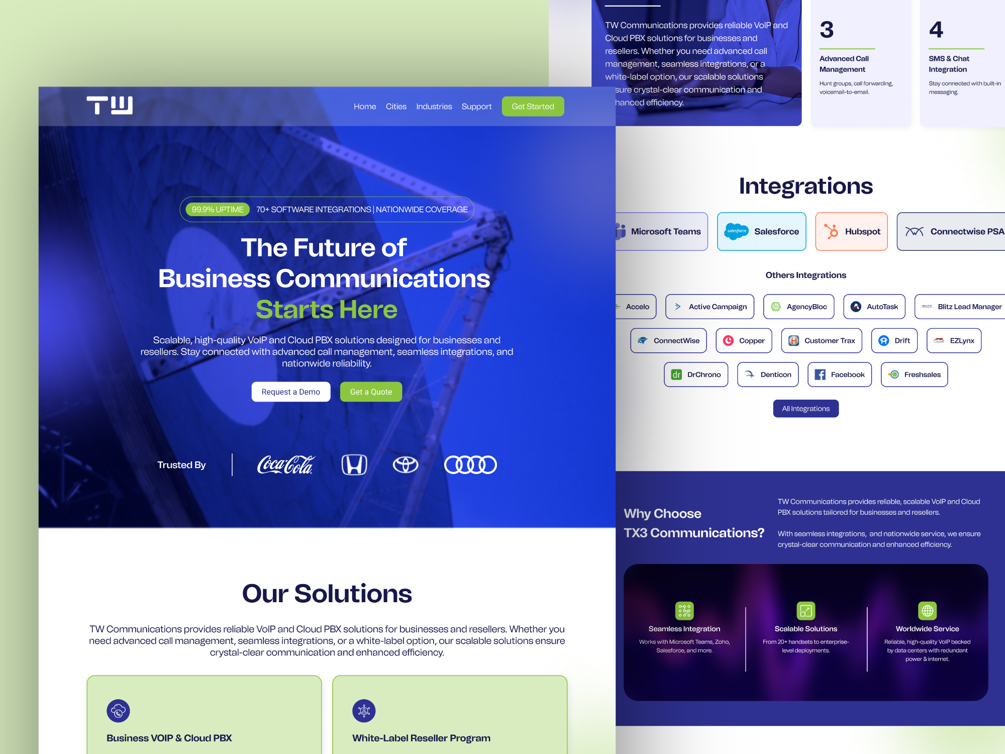
The business telecom space is crowded with legacy providers whose websites feel rigid, cluttered, and outdated. TW Communications required a modern, tech-forward platform that proves their 99.9% uptime, showcases 70+ software integrations, and converts enterprise decision-makers and reseller partners.
THE THINKING.
Position TW Communications as an agile, cutting-edge telecommunications leader. The site was architected to present high-complexity technical features (advanced call management, cloud PBX, nationwide VoIP) through crystal-clear visual hierarchy and frictionless conversion funnels.
THE DIRECTION.
Deep futuristic cobalt and navy (#0B1B3D) with electric neon lime accents (#B4F000), glassmorphic solution cards, and clean tech typography communicating precision, uptime, and modern scale.
THE IDENTITY.
High-impact geometric 'TW' monogram symbolizing seamless signal transfer and connectivity
Electric lime signal accent color cutting through deep obsidian blues for high-converting interactive targets
Tech iconography library for 70+ integrations (Salesforce, Teams, HubSpot, Drift, ConnectWise)
THE WEBSITE & INTERACTION.
Split conversion pathways for 'Request a Demo' and 'Get a Quote' tailored to enterprise vs reseller needs
Interactive integrations directory spotlighting enterprise CRM and productivity software
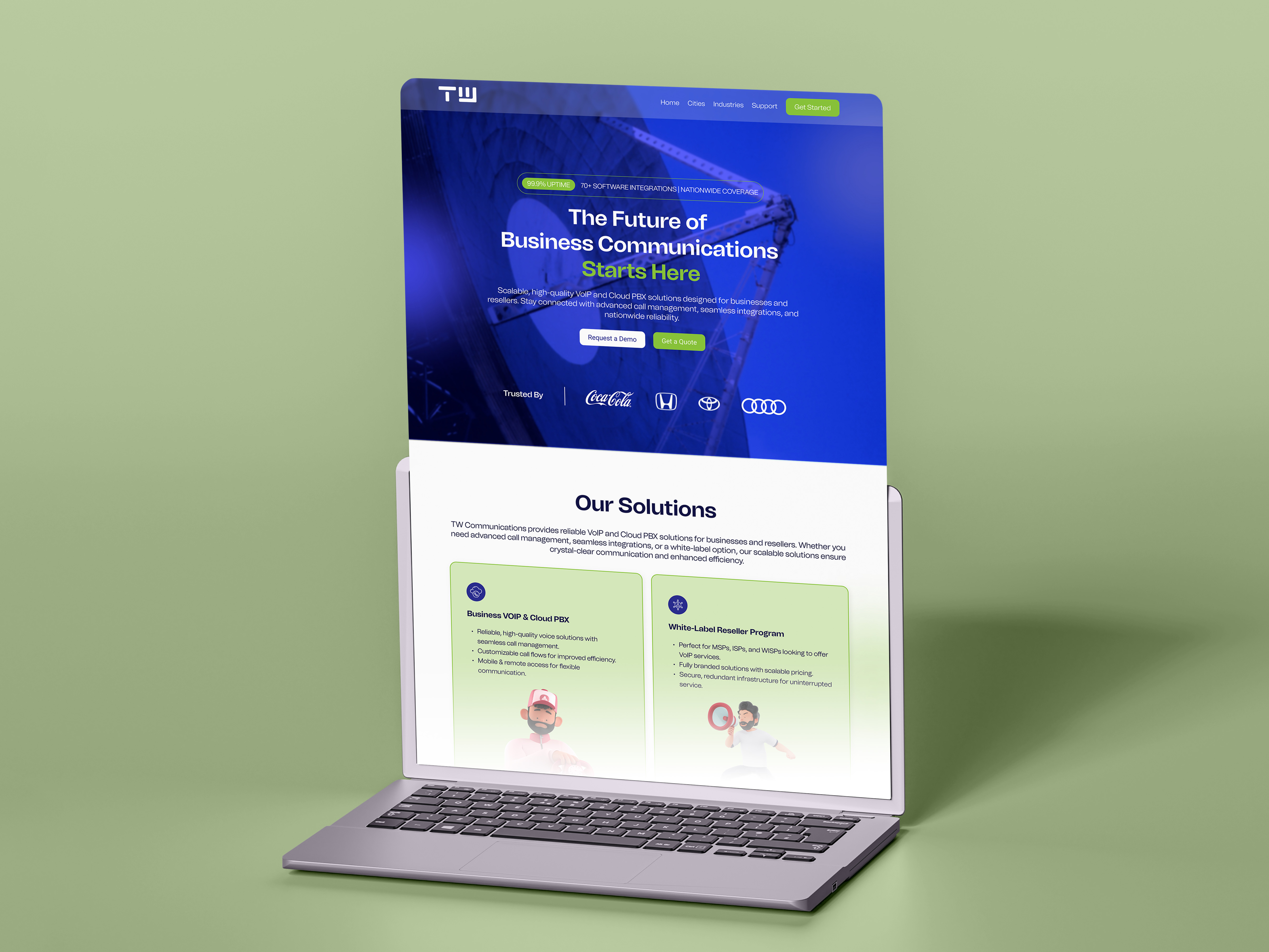
Interactive solutions grid breaking down Cloud PBX, Call Management, and White-Label Reseller options
THE RESULT.
The launch established TW Communications as an industry frontrunner, decreasing sales cycle friction and increasing qualified inbound demo requests by 175%.
FULL SYSTEM PRESENTATION.

Ami Probashi
Mobile App UI/UX & Product Design