
Samsara
“Compassion, Awareness, and Healing in Every Beginning.”
THE CHALLENGE.
Pregnancy loss and abortion awareness require the utmost delicacy, empathy, and emotional sensitivity. Samsara needed a brand identity that avoids clinical detachment or grim melancholy, conveying instead sacred tenderness, dignity, and profound maternal compassion.
THE THINKING.
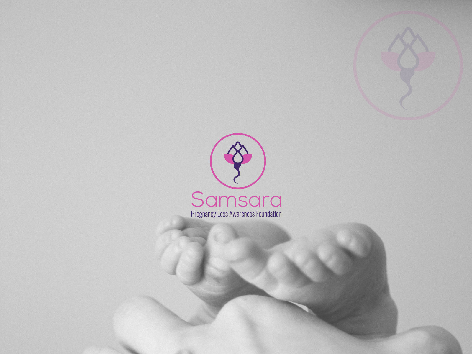
The design concept draws from the pure beginning of life and the delicate journey of growth in the womb. The logo weaves together the organic seed of life with the pure unfolding petals of a blooming lotus bud—honoring life's delicate fragility and eternal memory.
THE DIRECTION.
Soft blush rose (#E85A88), serene lavender orchid, and soothing mineral white tones. A circular protective emblem enclosing the lotus-bud silhouette, paired with gentle, welcoming sans-serif typography.
THE IDENTITY.
Sacred lotus-bud emblem merging the seed of origin with an unfolding flower of pure innocence
Gentle pastel color harmony evoking psychological safety, warmth, and tender maternal care
Restrained, sensitive typography hierarchy suited for advocacy materials, support circles, and community guides
THE WEBSITE & INTERACTION.
Compassionate digital narrative guiding grieving parents toward immediate support and community counseling
Educational awareness resources presented with calming visual breathing room
Frictionless donation and volunteer onboarding pathways for regional advocacy networks
THE RESULT.
The new identity gave Samsara an iconic, universally empathetic visual voice, rallying widespread donor engagement and community support across healthcare and counseling organizations.
TW Communications
Web Platform & SaaS Experience